Friday, August 29, 2014

The Mathematics of Composition

Moderns Film could be considered one of the most advanced forms of media we have today. When done well, films effectively combine the elements of sound, composition, story, talent and more to create one fluid cinematic piece. It takes years of hard work and sheer talent to master all of these elements. Until then, it’s a good idea to focus in on one area of film that interests you more then the others.

Chris Knight, writer of fstoppers.com, has created an ultimate guide that makes learning one such element much easier. Specifically, composition – a defining element of film, and pretty much the defining element of photography.

Wait, You mean that rule of thirds thingy?

Ah yes, but as Knight proves in his article, it goes far beyond that nine-box rule.

With pictures and examples guiding his definitions all the way though, Knight provides a clear guide to the mathematics behind beautiful composition.

After reading his article, and in an effort to beat Arturo to the punch, I’ve decided to review some of my own work to see if it stands up to the test.

Center Composition


The first and most basic type of composition Knight mentions is center composition. For this I used a picture I took while in the middle of nowhere. The road stretched on for miles and the lighting was fantastic. With flat land on both sides of the road, this was a perfect time to use symmetry to my advantage.

It's not mathematically perfect, but still an effective example.

Rule of Thirds

The classic. The 101 of photography. When unsure how to compose a photo it's best to stick with the good 'ol threes. I found this photo of a prairie dog which falls right on the sweet spot. 


Golden Triangles 

When playing with angles, golden triangles are a great way to check composition. Knight uses a picture of the eiffel tower as a great example. 


I found one picture from Santa Monica that again, is not mathematically perfect, but shows how this type of composition can have a compelling effect. 


Frame Within a Frame

Another type of composition he mentions is the frame within a frame effect. 


It's a great way to give an extra layer of depth to the photo while at the same time putting extra focus on the subject. I managed to achieve this once this summer as Erin walked through the main gate at Mount Rushmore. I was lucky enough to capture the moment by chance, but usually you need to plan out shots like this. 


In this picture her figure does not fall right on the rule of thirds line. In fact, she's quite a bit under it. But it slightly dwarfs her and makes Mount Rushmore seem even larger. The point is that in the end, art is art, and mathematics can't always determine its effectiveness. But it's a great starting point for discovering what might look cool. 

Composition


The first and most well known type of composition is center composition. As the name suggests, it places the subject or main focus of the shot.
Center Composition from Hot Fuzz
Center Composition seen again in Jaws.
Very often center composition will have symmetry in the shots. As the article note, director Wes Anderson uses lots of center composition in his films, almost all of them having near perfect symmetry.

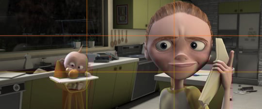
The next type mentioned in the Rule of Thirds. The rule of thirds can be very helpful in placing important parts of the image where the eye will be drawn to them. This is achieved by drawing two evenly spaced horizontal lines across the frame and two evenly spaced vertical lines down the screen. This creates nine equally sized boxes. It is along those lines and at those intersections where the parts of the shot you think are most important should be placed to stand out the most. 
The rule of thirds is pretty incredible...get it?
As seen in this shot from The Incredibles, many of the important details of the shot; the phone, the baby, both characters eyes, are either on or very close to the lines and intersections.

The next type of composition is called The Golden Triangle in reference to the golden ratio, which the composition type uses. The main line of the shot bisects the screen into two diagonally. The line is called the major line. Another lines comes out from this line in a perpendicular manner creating the triangle.

There are two types of diagonal composition. The first type, sinister, goes from right to left, while the second type, baroque, go from left to right. This can often be told by the subject of the shots face and where they look. 
I'm not allowed to talk about this one
In this shot from Fight Club, we can see the sinister diagonal composition in Tyler Durden's gaze.
Below is an example of Baroque composition.


the final type of composition is perhaps the most artistic. It's called the Golden Ratio. The article describes the golden ratio as "aesthetically pleasing proportion where the largest shape is divided by a perfect square, and the resulting rectangle is in exact proportion to the original one" 

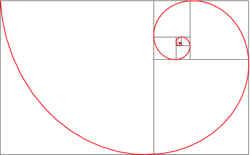
The golden ratio is best know as being involved in the fibonacci sequence, where a number is the sum of the previous two numbers. This appears everywhere in nature. The most common image associated with it is the golden spiral. 

Note: Spiral not actually golden.
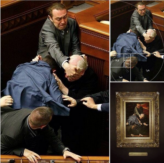
This composition type was very popular in renaissance art and more recently, fighting Ukrainian politicians.
 In the below image we see the golden ratio in Paul Thomas Anderson's epic There Will Be Blood.
Actually very little blood.


Center Composition

Even though center composition is the first topic in the series of articles, I actually read them all, I just found the theme of center composition to be intriguing. Like they said in the article "If one were to hand a camera to an aunt, and ask her to take a picture, she would most likely photograph the subject in the center of the frame." Basically, center composition is one of the most basic forms of framing. But because it is so simple, it is so easy to mess up. Being at a student film school, I see a lot of techniques that turn out extremely well, and some, well, not the best. Even though it is such a simple use of framing, Wes Anderson's work displays that just about any technique, when perfected, can be a staple of any great film, or film-maker. Here is an example of his work in relations to center composition.


Here are some other examples of center composition in movies:


Iron Man (2008) - Director of Photography: Matthew Libatique


Dirty Harry (1971) - Director of Photography: Bruce Surtees


The Shining (1980) - Director of Photography: John Alcott


Almost Famous (2000) - Director of Photography: John Toll


Meloncholia (2011) - Director of Photography: Manuel Alberto Claro


Here is a clip I shot for my FF1 film: "A Shrouded Order" that utilized center composition. I'm not saying its a good example, just an attempt by me. Feel free to criticize.


A Knight in Golden Armor

Get it? Chris KNIGHT? GOLDEN ratio? I digress.

I'm a big fan of this article, mainly because our man Chris Knight found an unpretentious, non-patronizing way to tell us not-so-savvy-with-a-camera people how to make small adjustments to better our poorly composed scenes. He understands what a film/television student really needs: big pictures with not a lot of words underneath.

This is a circle.
I've had a slew of high school teachers attempt to explain the golden ratio, and all I really got out of it was that I would never pursue a career in math and George Clooney was scientifically gorgeous (duh).

Symmetry is sexy.
But along came Mr. Knight with his diagrams and BAM! I am now a member of the club known as "Basic Understanding of Rectangles". Shot a little too crowded? Take ten paces to your left and try again. Subject look a little boring in the center of the frame? Shimmy over to your right and the interesting shot is yours.

The most adorable Rule of Thirds.


I was most affected by one of the smaller points of the article. Knight explained the basic technique of using a frame within the frame (a tunnel, a tree, a window, etc...). But, you can also use darkness as a frame. If you want to highlight a subject in the distance, keep your foreground dark. I always found lighting tricky, but this quick little tip really helped keep the basics of lighting in perspective.


Obviously these concepts are only the basics of composition, but it's a great start to the more complex aspects of setting up a shot. So put down your "Composition for Dummies" book, check out Chris Knight's "The Ultimate Guide to Composition", and explore the depths (of field... ha...) of framework. 

Composition & Bokeh

The part of these articles that I was drawn to was bokeh. I personally love the aesthetic of bokeh. Knight says “Obsession with bokeh is bad for your photography.” I somewhat agree with this statement. Too much can become repetitive and boring, however, I think if you use it in the right way and for the right photograph it can be amazing. Sometimes it’s better to see all the details and textures throughout the frame and other times those details don’t add anything. It really comes down to personal preference and judgement.


For example, in this photograph I think the bokeh works very well because it would be too busy with every detail in focus. You would get lost in all of the details and wouldn’t be drawn to the intended subject.

Chris Knight did a great job explaining some complicated concepts. Talking about composition rules such as the Baroque Diagonals, the Golden Ratio, the Rule of Thirds can become overwhelming. I like how he stated these are rules but are not rules at the same time. If you follow these rules it will not always lead to a provoking photograph. However, it is obviously important to read about and understand the rules for reference. I loved how well Knight explained what each rule was and how to apply most of them. After reading these articles I am more confident in what they are and how to integrate them. I’m looking forward to incorporating this new information into my future class, personal, and professional projects.