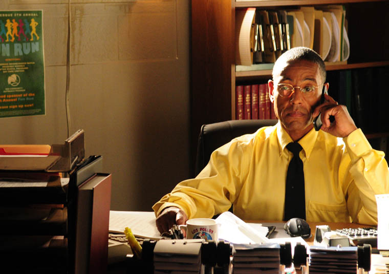
One of the few television shows I watch religiously is AMC's Breaking Bad. The show is about a high school teacher that begins cooking meth to pay for the treatment for his lung cancer. Breaking Bad is currently on the second half of its fifth and final season.
There are many reasons Breaking Bad is my favorite television show; not only is the plot incredibly in depth but also the camera work is next to perfect. Everything is very thought out, from the lighting, to the camera angle, and even the color of the characters clothes.
It is small things, like the color of the character's clothes, that I think separates this show from others. Character's clothes from most shows are picked out or designed so the character looks good, with nothing else much in mind. However, in Breaking Bad, the characters clothes are based on their mood and recent actions. For example, when the main character, Walter White, is feeling defeated, he wears a drab, khaki color. Or when he is becoming more involved in cooking blue meth, his clothes are more blue. This amount of planning is put into not only all of the characters outfits, but also other aspects of the show. More about this theory can be read here. There is also a very helpful picture chart contained in the article.
About this time last year, I started watching a new television series on AMC called The Walking Dead. With Halloween around the corner, this new show is packed with guns, violence, and you guessed it, zombies. The second season just started up this past Sunday, and left the audience in shock with a surprise ending. Compared to the other zombie movies and shows, this one definitely has the most realistic looking zombies and a practical plot that every other zombie movie is missing. After a virus breaks out, a group of survivors are forced to leave their home in attempt to find a secure location that hasn't been infected yet. There is no vaccine and they are getting by day to day with what they can find. The streets are blocked due to all the traffic that tried to escape, so the use of vehicles is almost imposs ible. This is what a zombie apocalypse would be if one
were to happen in the US.
The presentation of the zombies is awesome. Each one is unique and acts differently to the one standing next to him/her. The makeup artist and costume designers both won awards for last years season at the Saturn Awards Ceremony for TV shows. Below you can see a before an after picture with the makeup and effects. Picture
Last, I wanted to comment on the music and sfx in the show. Almost every dramatic scene is silent on this show. At first, I didn't like how they were setting the tone, but later I realized that with no music, you could never tell when something was gonna happen or pop up. You can't guess, which sometimes pisses me off, but makes for great TV. The Walking Dead is a mini series and I seriously suggest you catch up on the episodes if you want a good scare and plot. You can find all the episodes at amctv.com or 1channel.tv. Any questions or comments, please ask. I love discussing this show.
Breaking Bad is a drama on AMC about Walter White, a high school chemistry teacher from Albuquerque, New Mexico, played by Bryan Cranston. After White is diagnosed with advanced lung cancer, he turns to a life of crime producing and selling methamphetamine (crystal meth) with a former student named Jesse Pinkman. It has been nominated for numerous awards including winning three consecutive Emmy Awards for Lead Actor in a Drama Series for Cranston. Now in it’s fourth season it is less about Walt and his cancer for he is in a way the cancer in other people’s lives. He is bringing them down with him and putting them in danger as well.
Breaking Bad is one of the most suspenseful shows in television. Most shows play it safe and never put their lead in to much danger. Walter White’s brother-in-law even works for the Drug Enforcement Agency and is at times unbeknownst to him looking for his own brother-in-law, Mr. White. Breaking Bad creator Vince Gilligan said in an interview that they try to paint themselves into corners that seem impossible to get out of. This forces them to be creative and new. Some of their creativity comes from editing. From the time lapse cutaways to actual unusual cuts during the scene, Breaking Bad is willing to take chances and break a lot of the “rules” to help show the effects of drugs or to make a symbolic point. A great example was in a recent episode from the latest season where Jesse is playing a violent video game and is getting haunting memories from when he had to shoot an innocent man named Gale to protect himself and Mr. White from dying.
The show also forces you to pay attention to every detail. This show is not most shows where if they want the audience to see something they will make it blatantly obvious with a cut of a close up or a musical cue. Breaking Bad is more of a puzzle. For instance in last Sunday’s episode Gus, who doubles as Mr. White’s boss and an owner of Los Pollos Hermanos, a fast food chain, attempted to poison the entire cartel in Mexico by poisoning their alcohol he gave them as a gift. To not drawn suspicious he was forced to drink to. However we did not know he poisoned it. In a scene afterwards we see him seemingly throw food or something in his mouth (it was an anti-dote) and then minutes later the cartel started dropping like flies. There is also suspicion and many freeze frames online that think that Mike, one of Gus’ men, was going to surprise and shoot Jesse in the back before he was shot himself from an alive member of the cartel. A lot of this I did not catch the first time and I can’t wait to watch episodes again and catch new things I never saw before.
Finally, there is a conspiracy online about Breaking Bad and its connections to color. My friend and I have noticed this but we went online to see if we were not crazy in thinking this. Others agree but are not quite sure yet what it all means. For example Mr. WHITE wore a lot of green and there was a lot of green in the set when he was cooking the original meth product, which omits a green gas. However after a new type of chemical was added and changed their product to blue he has wore a lot of blue and the set pieces became very blue. His wife Skylar and sister-in-law wear colors off of blue (light blue and purple respectively). Gus wears a lot of gold and forces his employees to wear a lot of gold either at Los Pollos Hermanos or even when Walt and Jesse cook meth for him. They trade in their colors for Gus’ as if Gus then owns them in those scenes. Even Jesse’s last name of PINKman is about a color. Only time will tell if this is just is fans conspiring or a deliberate detail in the genius show that is Breaking Bad.
I recently finished watching a number of different shows and was in need of something new to sink my teeth (and my rapidly decreasing free time) into. Knowing that I am both into advertising and the 1950s, a friend of mine suggested that I watch Mad Men. I had not previously intended on getting into the series, mostly because of all the hype the show had received over the years. I didn't want to be disappointed if it turned out to be just another run of the mill drama. I was pleasantly surprised to find that I was wrong.
Mad Men is a highly stylized and highly entertaining show, created by executive producer Matthew Weiner for AMC. The show's website sums it up well:
"The series revolves around the conflicted world of Don Draper (Jon Hamm), the biggest ad man (and ladies man) in the business, and his colleagues at the Sterling Cooper Draper Pryce Advertising Agency. As Don makes the plays in the boardroom and the bedroom, he struggles to stay a step ahead of the rapidly changing times and the young executives nipping at his heels. The series also depicts authentically the roles of men and women in this era while exploring the true human nature beneath the guise of 1960s traditional family values."
While the writing is outstanding and the acting spot on, the most impressive aspect of Mad Men is the production design. From the wallpaper to the liquor bottles, everything is hand picked to transport the viewers into the world of New York and LA in the late 1950s/early 1960s. The creative team, guided by Matthew Weiner's vision, responsible for crafting the look of the show is headed by Production Designer Dan Bishop and Art Director Chris Brown. Along with a large team of professionals ranging from graphic designers to historical researchers, the duo makes sure that the show is as authentic as possible. Dan Bishop says in an article,
"...we want to try never to be inaccurate. The question is, did it exist in 1962? Then the next question is, was it in common use in 1962? And then, was it in common use in New York City? Sometimes we will say, "You know what? Probably most people didn't have this in their home in 1960, but this character is modern and up-to-date and maybe they had it shipped in from the West Coast."
An example of this meticulous attention to detail can be seen in the Drapers' kitchen:
Part of the allure of this show is that you are given a glimpse of life in transition between two very different decades: the demure '50s to the wild '60s. The sets and props are designed to change with the times. You can see how the outside world affects the characters' own worlds through both the costume design and the set design. For example, the Drapers' living room gets a makeover in the third season to keep up with the trends of the time. Their original living room is filled with '50s pastels and light floral accents:
When it is redone, the room has a more modern feel with the bold prints and primary colors of the '60s:
Since the show's beginning in 2008, Mad Men has been given awards left and right. The show has won the Excellence in Production Design Award from the Art Directors Guild consecutively for the past four years as well as many Emmy's for "Outstanding Art Direction for a Single-Camera Series." These prestigious awards and the excellent quality of the show itself will keep it running for many more seasons, which give me many more years of nerding out about antique rotary phones and floral wallpaper.
--------------------
Here's a short video piece that talks more about the design choices with Dan Bishop and set dresser Amy Wells:


 the bold prints and primary colors of the '60s: