Showing posts with label Photography. Show all posts

Friday, October 31, 2014

Creating Depth in Art, Film, and Photography

Although 3D imagery is becoming more prevalent in blockbuster films, the fact still remains that depth is something established in 2D imagery.


A recent post on zevendesign.com outlined 8 pain ways to establish depth it art, photography, and film.

  • Atmosphere 
  • Color
  • Linear Perspective
  • Light
  • Shadow
  • Solidarity
  • Focus
  • Movement


We've all read or watched something that teaches us about creating depth, but the examples they used in this post were so beautiful and unique I found it necessary to share.


1. Atmosphere

The man stands holding an axe in front of the misty forrest that slowly fades off in to the distance. This form is depth is created by having the background less clear then where you want the focus to be.


2. Color

Maybe I'm just a color kind of guy, but I find this form of depth to be the most interesting. The repetition in color palette reveals some of the science behind creating depth.  


The opposite is also true with a white background.


3. Linear Perspective


Linear Perspective is probably an obvious one and usually one of the first ways we thing of creating depth. It's what your second grade art teacher called "the vanishing point". All of the material in your drawing is aimed at one focus point.


4. Light

Obviously if you point your light on to what's in the foreground the attention is going to focus there. But in this post they used light to show that when something is lit in the background, you get a very interesting effect. 


 In the picture below I feel pulled in to the scene. That path is beckoning for some quality strolling down.

The Light here is used in a much more metaphorical way. The focus in this painting ties in to religious beliefs on where our focus should be in life. Although we may first look at the man, that is not where the attention is pulled in the painting. 

5. Shadow


One the flip side of the last one, attention can be brought to what is not in the light by using shadows.


6. Solidity 


Solidity refers to the level of detail in different parts of the image. Solidity differs from focus in that it is usually used in cartoons and paintings. With this technique, the foreground has more attention detail then what is in the background.


7. Focus

Focus is the most common way to achieve depth in film and photography. It can also be achieved in computer art and animation, as they show in a couple of these examples:


 And hence forth the term "Bokehlicious" was created. 

8. Movement

Movement is another common technique used in film in photography. When your subject is on the move, moving the camera with them can blur stationary elements and bring focus to the subject. 


Which is also a synthetic effect I used in our promotional poster to give depth to the room:

The opposite of this (stationary subject with a moving background) is another way to achieve this effect. (Shout out to that time we made Cracked).


Of course, many of these examples are not limited to their exemplified use. Often times, it is the combination of several of these techniques that create depth in a scene. It's up to you to decide which ones will fit your image for the right effect.

Tuesday, October 28, 2014

Feeding the Crew for Dummies

FOOD.
Great! Now that I have your attention, I'd like to discuss an important matter with you all. For years, film crews have been going hunger. Whether they're not being properly fed on set or if they simply forgot their granola bar at home as they were running out the door to make call time, film crew members are hungry. Heck, I'm hungry right now! Imagine how the people working feel! With the poor, malnourished souls in mind, I think it's time. It's time to learn how to feed these hard workers. It's time to learn how to keep your crew happy. It's time for "Feeding the Crew for Dummies!"

Now, everyone knows that a person with a full stomach is a happy person. It's a fact of life. If you don't agree with me, get out. Leave. Don't ever come back here again. If you do agree with me, or if you simply don't care enough to leave, then join me as we explore the inner workings of the film food business. Essentially, the business includes three branches: craft services, caterers, and food stylists. These wonderful people have a lot on their plate...get it? Let's see what their exact responsibilities are...

Craft Services.
Sounds simple enough, right? Craft services, which is a separate entity from catering, encompasses all of the wonderfully assorted snacks and beverages provided to the film crew. The godsend in charge of craft service sets and maintains a station near the production that makes these snacks and beverages available to all the hardworking folk on the crew. A budget is given to the craft service person prior to attaining all the refreshments. I guess Costco just isn't good enough for some people. Personally, I'd be fine with some Cheez-Its and juice boxes.

Caterers.
The caterer takes care of the main meals for a production. While craft services prepares the snacks, the caterer plans, organizes, and prepares all the substantial nourishment for everyone. Having a caterer on location is a serious convenience. On one hand, the crew can be more efficient. The food is right there for them to grab on a thirty-minute lunch break. On the other hand, you save extremely valuable production time and money without the need to transport the crew to and from meals. Caterers have been known to serve small crews from ten people to enormous crews of hundreds of people. "But what can I eat? I'm vegan?" "What about me? I can't eat gluten!" No worries! These are fairly common requests for production caterers. They'll cater to your personal needs! (I'm on fire today with these puns).

Food Stylists.
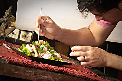
But what if you want your food to look nice? Let's be honest, we ALL want our food to look as good as it [hopefully] tastes. This is where the food stylist comes in. Their job is to prepare and arrange food in a particularly appealing way. They typically have an extensive background in cooking, recipe development, and the ability to make food look its best. Oh yeah, I almost forgot to tell you that the food stylist doesn't actually help out the crew. Not really, anyway. Their job is aimed at food used in photographs, commercials, or movies. So they're making sure the food looks good on camera, not on your plate. Sorry I didn't mention that sooner.

It's often a crew member's first question when walking on set (or at least it's mine) to ask what's being served for lunch. It turns out that it's not actually the producers' job to take care of it, although that's how we've been doing it on our student films. Food service workers are, in my personal opinion, some of the most spectacular people on a production. And if you don't agree with that, well, you can just keep that to yourself.

Monday, October 20, 2014

Downgrade Magazine

Downgrade Magazine is the name of a currently non-existing magazine with a particular focus on downhill skateboarding.


It has the been the collaboration of 5 different artists for the past 2.5 years, and now they finally feel that they have enough material to come out with their first issue.


There are plenty of downhill skateboard magazines already:

http://wheelbasemag.com/
http://www.skateslate.com/
http://www.heelsidemag.com/

But I feel that Downgrade is bringing something entirely new to the table. All magazines are designed to be ad free, with no forced influences from outside sources. They will be releasing 3 magazines a year, each with a different focus and theme. 


Issue 1 will feature only photographs and will be printed on unbound, heavy weight newsprint, designed to be taken apart and displayed. Issues two and three will have their own unique focus's, ranging from the history of downhill skateboarding to the current people that make the industry what it is. 

Another thing that makes this magazine so unique are the influences of the five photographers who make up DGM. They all come from different photography and skateboarding backgrounds, giving this magazine a vibe that is different from any magazines currently in the industry. 

(Matt K, photographer for DGM and famous skater. PC:Thomas Trnka)

The people behind the magazine are extremely devoted to their craft, and it shows. To make the first issue a reality they are asking for $20,000 on kickstartr. This sounds like a lot, but for the first print of a magazine that is ad-free, it is a reasonable amount. Here's their kickstarter video: 


DGM's photographers are so unique and have such immense skill that I believe this magazine has the ability to both non-skaters and skaters alike. I strongly encourage you to watch their video, if not to donate, just to see what they are about and appreciate their take on photography.

Friday, August 29, 2014

The Mathematics of Composition

Moderns Film could be considered one of the most advanced forms of media we have today. When done well, films effectively combine the elements of sound, composition, story, talent and more to create one fluid cinematic piece. It takes years of hard work and sheer talent to master all of these elements. Until then, it’s a good idea to focus in on one area of film that interests you more then the others.

Chris Knight, writer of fstoppers.com, has created an ultimate guide that makes learning one such element much easier. Specifically, composition – a defining element of film, and pretty much the defining element of photography.

Wait, You mean that rule of thirds thingy?

Ah yes, but as Knight proves in his article, it goes far beyond that nine-box rule.

With pictures and examples guiding his definitions all the way though, Knight provides a clear guide to the mathematics behind beautiful composition.

After reading his article, and in an effort to beat Arturo to the punch, I’ve decided to review some of my own work to see if it stands up to the test.

Center Composition


The first and most basic type of composition Knight mentions is center composition. For this I used a picture I took while in the middle of nowhere. The road stretched on for miles and the lighting was fantastic. With flat land on both sides of the road, this was a perfect time to use symmetry to my advantage.

It's not mathematically perfect, but still an effective example.

Rule of Thirds

The classic. The 101 of photography. When unsure how to compose a photo it's best to stick with the good 'ol threes. I found this photo of a prairie dog which falls right on the sweet spot. 


Golden Triangles 

When playing with angles, golden triangles are a great way to check composition. Knight uses a picture of the eiffel tower as a great example. 


I found one picture from Santa Monica that again, is not mathematically perfect, but shows how this type of composition can have a compelling effect. 


Frame Within a Frame

Another type of composition he mentions is the frame within a frame effect. 


It's a great way to give an extra layer of depth to the photo while at the same time putting extra focus on the subject. I managed to achieve this once this summer as Erin walked through the main gate at Mount Rushmore. I was lucky enough to capture the moment by chance, but usually you need to plan out shots like this. 


In this picture her figure does not fall right on the rule of thirds line. In fact, she's quite a bit under it. But it slightly dwarfs her and makes Mount Rushmore seem even larger. The point is that in the end, art is art, and mathematics can't always determine its effectiveness. But it's a great starting point for discovering what might look cool. 

Composition & Bokeh

The part of these articles that I was drawn to was bokeh. I personally love the aesthetic of bokeh. Knight says “Obsession with bokeh is bad for your photography.” I somewhat agree with this statement. Too much can become repetitive and boring, however, I think if you use it in the right way and for the right photograph it can be amazing. Sometimes it’s better to see all the details and textures throughout the frame and other times those details don’t add anything. It really comes down to personal preference and judgement.


For example, in this photograph I think the bokeh works very well because it would be too busy with every detail in focus. You would get lost in all of the details and wouldn’t be drawn to the intended subject.

Chris Knight did a great job explaining some complicated concepts. Talking about composition rules such as the Baroque Diagonals, the Golden Ratio, the Rule of Thirds can become overwhelming. I like how he stated these are rules but are not rules at the same time. If you follow these rules it will not always lead to a provoking photograph. However, it is obviously important to read about and understand the rules for reference. I loved how well Knight explained what each rule was and how to apply most of them. After reading these articles I am more confident in what they are and how to integrate them. I’m looking forward to incorporating this new information into my future class, personal, and professional projects.