Showing posts with label Wes Anderson. Show all posts

Saturday, October 3, 2015

Symmetry yrtemmyS

When learning the basics of composition it seems that above all else we're told to keep our object of interest away from the center of the frame. I've been told by various professors, YouTubers, and film books that these kinds of shots are boring to look at, visually unappealing, and overall can reduce the quality of a film. While in certain circumstances I admit that a symmetrical shot can come across as bland, I strongly believe that when done right these kinds of shot's can ut across a wealth of visual information.

Take for instance the work of Wes Anderson:
Though he may currently be the poster boy for symmetrical shots, I can think of very little instances in which the symmetry of the shot didn't add in some what to the content of the film. These kinds of shots don't take me out of the film, but rather draw me in to it's world and atmosphere. It's very rare that a serious drama would never design a shot that's as cloying twee as some of the examples posted above, but at the same time i don't think a lot of comedy films would benefit from the harsh lighting a lot of drama's benefit from.

It's all a matter of design really. If you feel that a shot would benefit from being arranged in a certain way, I really couldn't care less about what a book or professor might have to say. 

Friday, October 17, 2014

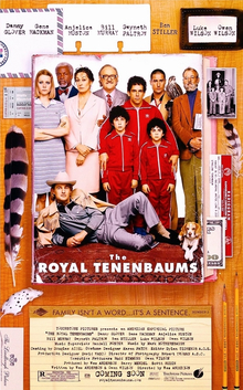
Arrested Tenenbaum or The Royal Development: How Wes Anderson's most dysfunctional family influenced one of the funniest shows of all time.

Holy really long blogpost title Batman. If you had not guessed I recently watched Wes Anderson's The Royal Tenenbaums. As I watched it I began to notice a striking amount of similarities between the movie and Mitchell Hurwitz's series Arrested Development. In fact Arrested Development was described as Royal Tenenbaums shot like COPS. Hurwitz almost didn't pitch Arrested Development


     Let's start off with the heads of the family, with Wes Anderson we have the titular Royal Tenenbaum. Royal is rich, irresponsible and shows little affection for his family. His Arrested Development double would be none other than George Bluth. Like Royal, George is rich, a criminal, and a pretty terrible father. Both men are extremely selfish and irresponsible, forcing the responsibilities on his children. 

     The family's only daughter in both RT and AD is an adopted daughter who is unhappily married to their husbands. In both cases the husband is oblivious to their wifes dissatisfaction with the state of their marriage. Lindsay Bluth however is more of a step down from Margot. While Margot simply holds ill will towards her family, Lindsey takes after her father much more, as do most of the Bluth children. Margot also serves as the inspiration for Maeby Bluth, as both Maeby and Margot are adopted but also fall in love with a family member.
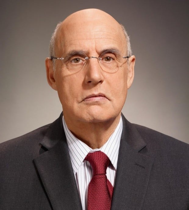
Last but not least is the overprotective son/father. Ben Stiller's Chas and Jason Bateman's Michael have a lot of similarities. Both are overprotective and have lost their respective wives.They both seem to think that they have control over a situation when in fact they do not. 
Both the show and the film use a similar style of narration to deliver backstory though AD's tends to editorialize more. 
Though not capturing his signature style (probably a good thing) Arrested Development takes a lot from The Royal Tenenbaums. Wes Anderson's film is like a father too the series, but a good father, not like the ones seen in both works.


Friday, September 12, 2014

The Grand Budapest Hotel


I recently watched Wes Anderson’s film The Grand Budapest Hotel. It tells the advendtures of Gustave, a legendary concierge and Zero Moustafa the lobby boy who becomes his most trusted friend.


I thought it was very interesting and extremely well made. Wes Anderson’s films are known for their distinctive visual and narrative style. After watching this movie I can understand why. Every aspect of the film was planned and executed in a very specific manner. There are some great camera angles and very elaborate sets. I’ve never seen a movie with such precise camera movements. I didn’t really care for the story but the cinematography made the movie, at least for me. The movie could be paused at any point and each frame would look amazing. Every single frame is a mesmerizing and stunning composition of colors and textures. The constant flowing camera movements make you feel like you’re swimming through the hotel.  Basically, I just think it is a brilliant movie and everyone should see it.

Friday, August 29, 2014

Center Composition

Even though center composition is the first topic in the series of articles, I actually read them all, I just found the theme of center composition to be intriguing. Like they said in the article "If one were to hand a camera to an aunt, and ask her to take a picture, she would most likely photograph the subject in the center of the frame." Basically, center composition is one of the most basic forms of framing. But because it is so simple, it is so easy to mess up. Being at a student film school, I see a lot of techniques that turn out extremely well, and some, well, not the best. Even though it is such a simple use of framing, Wes Anderson's work displays that just about any technique, when perfected, can be a staple of any great film, or film-maker. Here is an example of his work in relations to center composition.


Here are some other examples of center composition in movies:


Iron Man (2008) - Director of Photography: Matthew Libatique


Dirty Harry (1971) - Director of Photography: Bruce Surtees


The Shining (1980) - Director of Photography: John Alcott


Almost Famous (2000) - Director of Photography: John Toll


Meloncholia (2011) - Director of Photography: Manuel Alberto Claro


Here is a clip I shot for my FF1 film: "A Shrouded Order" that utilized center composition. I'm not saying its a good example, just an attempt by me. Feel free to criticize.


Thursday, August 28, 2014

"The Ultimate Guide to Composition"

Chris Knight's "Ultimate Guide to Composition" covers the five types of compositions: center, the rule of thirds, golden triangles, diagonals, and the golden ratio/golden rectangles/golden spiral.

Center composition puts the subject in the center of the frame. If it's done well, the symmetry and intricate detail makes it aesthetically pleasing. I really enjoy this composition, but it is very hard to create a center composition that is very visually appealing and memorable. For inspiration, here are some of my favorite Wes Anderson's shots that use the center composition:


The rule of thirds divides the image into nine equal parts. Using the rule of thirds makes it easier to create an interesting image, as the off-center subject creates more tension in the shot.


The golden triangles divide the image into three or four triangles with a strong diagonal line, called the "major line," and another diagonal line that goes from one corner to the major line, connecting perpendicularly. That line is called the "reciprocal line." This creates a more dynamic photograph, as seen below. Just look at that bridge and its diagonal line. Powerful stuff.


The two types of diagonals are Baroque and Sinister. Baroque are read from left to right and Sinister are read from right to left.


Baroque:

Sinister:


The golden ratio is all about geometry and proportions. The largest shape is divided by a perfect square, and the remaining portion is the same proportions as the first shape. Then that shape is divided by a perfect square, and so on and so forth. It creates somewhat of a spiral on the frame:

This ratio also works on other shapes and is seen in the Great Pyramids, Stonehenge, the Parthenon, on the human body, seashells, and hurricanes.


Knight also focuses on other important concepts and theories that help make photographs more dynamic, such as a frame within a frame and the Gestalt Principles.

A frame within a frame is an extremely important theory that uses objects to frame the main subject. It's good to have a foreground frame that is darker than the background because our eyes go to the brightest parts of the image. 


Some of the Gestalt Principles are figure/ground, proximity and grouping, symmetry and balance, similarity, continuity, and closure.

Figure/ground means the subject and everything surrounding it is very contrasting. Using either chiaroscuro, strong contrasts between light and dark, and/or negative space, it enhances the illusion of depth.

When elements are placed together, they become a group. When similar objects are placed together, it becomes a whole. And elements with similar characteristics can be viewed as a group or pattern and can be very nice to look at.

Symmetry creates an equilibrium. As long as you make the center composition purposeful and dynamic, the symmetry is strong and appealing. Also, balance does not always mean perfect symmetry.

Continuity deals with leading lines. They can be straight or curved, but they're not alway obvious. They guide the viewer's eye to continue through the object.

Last, but not least, is closure. The subject is not fully seen, but the image gives your brain enough to form the rest. It "leaves a little to the imagination."

For me, learning the five main compositions was very helpful. I've learned the rule of thirds before, but learning and seeing the other compositions in use will help me frame my own shots and understand why certain photographs are more aesthetically pleasing than others.


Friday, October 4, 2013

Moonrise Kingdom Open Title Sequence

The opening sequence of Moonrise Kingdom is an absolutely brilliant use of cinematic elements that ultimately creates the persona of the film. The use of the pan in the first few shots gives the film a synergy feel as the music and visuals come together to make a playful introduction. A major emphasize I have been focusing on lately is attention to set design, color palates and character appearances, this film does a great job establishing the mood with its opening shots. Additionally throughout the film the focus on screen area, vectors and framing is overwhelmingly apparent. Another interesting aspect of this film is how even the yellow text at the opening was picked due to the location being in New England.  The type of font they chose was an older type than the time being portrayed due to the old school vibe of New England which the production team deemed was not as trendy opposed to a populated region of the country, therefore New England due to its slow changing environment it would take longer to adopt even simple trends such as text. As I am working as the art director in my production team for our short student film I have found that finding references such as this opening title sequence is huge to the success of our films look and feel. I learn so much about small details such as the font example, set design and many other insights from these videos. Lastly these are cinematic techniques that can be manipulated and pieced back together to ultimately play a key role in our student film and future films alike.


click on this link to watch the opening title sequence...
Moonrise Kingdom (2012) — Art of the Title


Moonrise Kingdom