Showing posts with label set design. Show all posts

Thursday, November 5, 2015

Looking back, looking forward

Now that we have (basically) wrapped on principal photography for Stopover City I feel a huge weight off my shoulders, and have started functioning like a normal human being again???! Obviously a lot has to be done in post production (our editor already has a rough cut), but I have confidence in my team that everything will be just dandy. Now I can do things again such as: sleep, eat meals, and look ahead to future projects. I had a ton of fun doing developing Stopover, and it has inspired me to start development on my senior thesis which I'd like to create next fall. It's honestly never too early to start pre-production, so why not start now! Pretty recently I decided not to take any production classes in the spring because this semester was so intense--I'll definitely work on other people's films here and there but I need a semester-long breather from production classes. 

Being less stressed has also allowed me to think ahead to future semesters logically--I turned down the offer to produce ICTV's late night show After Hours (which I currently Assistant Produce) because I realized that producing isn't my thing. The upside to turning it down is that I was given the offer to design a new set for the spring semester. Here's the current setup of the show:
It looks nice once cameras are framed up, but the walls are super heavy and those brown beams are literally falling apart and every Tuesday I fear that one of the PA's will get hurt. Fortunately Porn: the Musical is donating 5 of their thin white walls to us, which i can manipulate any way I'd like. I'd personally like to make the set a bit wider, and 86 the bland white walls altogether. It's definitely going to take some time & careful effort to plan, but I'm hella excited to do it.
It definitely won't be as extravagant as Late Night With Jimmy Fallon, but hey, I'll do my best with what I have. 

Thursday, October 22, 2015

Money, money, money...

...must be funny in a rich man's (not art department's) world. I quote this ABBA tune & say a little prayer that a money tree grows in my backyard tonight.

As production designer for our film, I am in charge of all the props, costumes, and set design for each frame, which entails 7 (kind of deadly) stages:
1. picking a color palatte
2. sketches of room designs
3. asking friends/other art people for common prop items
4. buying things online & praying they look like their picture
5. multiple trips to Salvation Army/Walmart
6. improvising....a lot (the prop weed is cotton balls rolled in glue, then rolled around in various spices, but hey it looks pretty realistic so thats ok)
7. crying because you have no money left

Depending on the project, an art department's budget can either be very minimal, or rather large. Because this is part of my independent study I went in with a "i'm going to plan for a lot of stuff and then get paid back later because I want this to look good and be worth it!!!" But right now I'm in that scary place of having spent money on art department and not getting paid back for it yet. Which means my bank account looks like this:
So I'm hoping that by some happy miracle more money is donated to our indiegogo so that I can afford to be paid back :) :) :)
Then again, if the film looks awesome, it's all worth the temporary debt, right???

Friday, October 16, 2015

Grand Designs and Flat Characters

If you're at all interested in horror or thriller movies chances are you're aware of the brimming box office success of director Guillermo Del Toro's (spelled his name right first try) newest film "Crimson Peak". Crimson peaks follows the story of a wealthy american heiress, played by Mia Wasikowska, who finds herself wed to struggling English inventor, played by Tom Hiddleston.

Mia is whisked by her new lover from the comfort of the streets of buffalo New York to a grand and desolate mansion in the heart of  the English countryside. After a few nights it becomes both clear to Mia and the audience that something ghostly is a foot, but for the sake of spoilers I'll spare you all the details of the rest of the plot.

Overall the film is gorgeous, I really found myself being sucked into the frame by the wealth of period details. Perhaps the only fumble on the part of the production design was in layering on too many heavy handed metaphors throughout. Early on in the film is compared to a butterfly and from that point forward there is distinct insect iconography in almost every scene. 

On the topic of butterflies, it's strange to me that Mia's character is compared to one so often despite the fact that she undergoes no character metamorphosis what so ever. Her character lacks any sort of motivation ; even when she's hit over the head with plot details that would leave any other person paralyzed with fear, she doesn't bat so much as an eyelash.

The film as a whole just felt a little bit too fast, like someone cranked up the speed on the haunted mansion ride at disney. There are a few scary parts, but the film jumps to the next scene so fast that you never get to seep yourself in the horror of the protagonists situation. I'd definitely recommend it to those of you looking to go into production design, but if you're looking for a truly gripping thriller you could do a whole lot better than Crimson Peak.

Monday, October 12, 2015

The Colors of Motion and The Godfather: Mostly Black

After Arturo briefly showed us the website The Colors of Motion in class today, I had to give it another look. The website basically breaks down the color palate of a film, making a sequential gradient that follows the color design of the film shot-by-shot. Of course, if you are just absolutely in love with a particular color breakdown, the website has poster-sized prints for sale. Oh, America. Anyways, I chose to take a closer look at one of my all-time favorite movies, The Godfather:


At first, it doesn't really seem to make much sense. Its just a bunch of colors. But you are able to click on each specific color, which brings up a still from that particular shot of the film. Pretty sweet.  It doesn't just have major shots or major scenes of the movie, it has every shot in the film. It takes into account every establishing shot, every cut away, and every close up. 

Just like the subject matter of the film, the color design of The Godfather is very dark. A lot of "earthy" tones come through in the films. Browns and greens dominant the color scheme, all very drab and unsaturated to mirror the somber mood of the traditional family crime syndicate stuck in a time of change in American culture. Oh, and of course all of the laundering, bribing, and murdering that takes place over the course of the film. 

 The iconic opening scene, mostly for its use of chiaroscuro lighting and slow rhythm that help to build tension and a sense of dominance in the scene. As far as the color design, it sticks pretty true to the overarching dark, earthy theme, except for the blood red rose positioned almost dead center in the frame:


Another example of the earthy, drab colors in The Godfather:

While The Godfather  might have its brief moments of color, it is clearly dominated by these heavy, dark tones that we associate with a crime drama. Even the portions of the narrative that take place in Italy, the farthest we ever get away from all of the murdering and crime have light browns and greens, consistent with the old Italian world in which the main character Michael is hiding in. 

The Colors of Motion website has a range of movies on it, from The Lion King to Se7en, each broken down by shot just like The Godfather. Seeing these color breakdowns lets you visual the color of a film in its entirety, and truly see how this subconscious element really does help to shape the story. Going forward,  I hope that the production design in Doll House will be an active element of the storytelling process. While not always blatantly evident, color certainly helps to tell the story. 


Thursday, October 1, 2015

That Time Period Accuracy Though

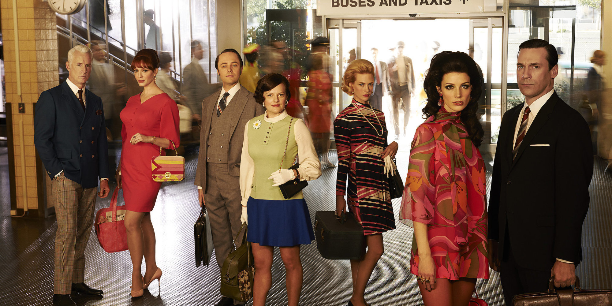
I recently started watching the show Mad Men and was simply floored by the aesthetic and production design. In making a period piece you have to be extremely attentive to even the smallest details. A visual that doesn't match the time could cause a jarring halt to the audience's immersion.


As I was looking up pictures of the set this one really caught my eye. If you are at all familiar with Piet Mondrian's work you can easily spot similarities. In a large selection of his artwork he focuses on using only primary colors and bold simple lines in his compositions. This classic combination of red, blue and yellow is seen everywhere from advertisements to IKEA furniture (and even the set of Mad Men!)
Composition II in Red, Blue and Yellow, 1930
Other than the set following famous artist's concepts, the costume design is extremely on point. It is always matching the year the show is in. My roommate is obsessed with this show and explained to me that you can actually see the fashion evolve as time passes throughout the seasons. When they start in 1960 the 'wet look' is very prominent with all of the men's haircuts slicked back. As it progresses they have softer almost feathered hair. With the woman's clothing you can see how the dresses became shorter and shorter, revealing more skin. Just see how flawless they all look: 


It took me awhile to get into the show because, to be honest, it's quite a slow start. But with how many awards Mad Men has won it is now apparent to me why the completely deserve it. If you watch you'll definitely appreciate the painstakingly details put into every aspect of the show's design.  


Friday, September 18, 2015

What I loved about Du Levande

After class Monday I couldn't help thinking about how much I enjoyed the brief clip of Du Levande we saw towards the end of the period. As soon as I got home I jumped online to get a better look at it, and perhaps identify what it was about Du Levande that ensnared me so. Take a look at the clip below to refresh your memory.
Now aside from having an incredible set design, I think what really captured my attention was the way the film strayed so fantastically from traditional narrative film. Instead of watching to unattainablely gorgeous people arguing over some fictitious drama, I was watching two obese people arguing on a park bench. What's more is that I related immediately to the characters in frame, I didn't need any sort of backstory explained to me or lengthy origin story behind why the bench woman was so miserable, I just got it. 

I wish that Hollywood would break away from the mold of talking head style films more. That's in part why I'm interested in pursuing a career in the commercial industry, I want to be able to experiment with different idea's without being forced to abide by the traditional Hollywood cinematic tropes.

Monday, November 4, 2013

Color Palette in Hell on Wheels

              Hell on Wheels and particularly the pilot episode of the first season is a strong example of how the use of color palette can enhance the quality of your footage. As the show opens on some of the scenes from the first episode for any trained eye the color palette is evident, for the common viewer this may be a subtle effect on the subconscious (or anyone's subconscious for that matter).  It is no coincidence that these colors showed up on the screen and is rather a design scheme. The make up of the scenes below are essential to establish the overall essence/feeling of what the show is aiming to convey. As the show is set during the civil war these opening scenes are additionally establishing the class of these soldiers compared to the everyday soldier who might be constructing the transcontinental railroad in the mid to late 1800's. Additionally the depth of field shown in this screen shot below is a magnificent example that brings dimension into the establishing shots of not only the episode but the TV series as a whole.


             The main character is a former confederate soldier who journeys to the West in search of work with the construction of the transcontinental railroad. While also seeking vengeance against the Union soldiers which killed his wife and son he is to be depicted completely different then the elite running the war behind the scenes.  The beige colors integrated with the black coats on these characters significantly set apart the individual from the background ultimately highlighting the prominent class and their power in the war as opposed to the common man of those times. A small detail which I believe adds to this scene is the bright liquids in the glasses. This contrast with an exceptionally neutral color palette calls attention to the subject at the table adding to the impact of the interaction taking place on screen. Although color may be the last thing on your mind when getting caught up in the many other duties associated when producing a TV show, film, documentary etc... it is not something to dismiss. The color palette can be any range of colors and often defines the feeling of your film, unlike that of framing your shot correctly, lighting or incorporating props that will aid you in telling the story, color selection is a theme (maybe not true for all movies but usually). Lastly as I attended the lighting demo a few weeks ago I remember the presenter mentioning how to make the actors believe their actually in the environment they are depicting. Similar to his example of pouring liquor around the bar set (to recreate the feel of actually being in a bar environment) color palette can be just as sensitive of a selection with actors if not more crucial in the process. Overall the set design and color palette doesn't only benefit the audience when trying to tell the story but it also puts your cast in an environment that is essentially a catalyst for their actions and in turn may lead to better acting (especially in the case of a student productions). Just some food for thought as we endure the intricate process of creating our own films.


Friday, October 4, 2013

Moonrise Kingdom Open Title Sequence

The opening sequence of Moonrise Kingdom is an absolutely brilliant use of cinematic elements that ultimately creates the persona of the film. The use of the pan in the first few shots gives the film a synergy feel as the music and visuals come together to make a playful introduction. A major emphasize I have been focusing on lately is attention to set design, color palates and character appearances, this film does a great job establishing the mood with its opening shots. Additionally throughout the film the focus on screen area, vectors and framing is overwhelmingly apparent. Another interesting aspect of this film is how even the yellow text at the opening was picked due to the location being in New England.  The type of font they chose was an older type than the time being portrayed due to the old school vibe of New England which the production team deemed was not as trendy opposed to a populated region of the country, therefore New England due to its slow changing environment it would take longer to adopt even simple trends such as text. As I am working as the art director in my production team for our short student film I have found that finding references such as this opening title sequence is huge to the success of our films look and feel. I learn so much about small details such as the font example, set design and many other insights from these videos. Lastly these are cinematic techniques that can be manipulated and pieced back together to ultimately play a key role in our student film and future films alike.


click on this link to watch the opening title sequence...
Moonrise Kingdom (2012) — Art of the Title


Moonrise Kingdom

Friday, September 20, 2013

Lighting in A Clockwork Orange

The name Stanley Kubrick is synonymous with innovation both on the screen and off. He was the first to bring the steadicam onto the scene for the filming of The Shining, and has also created other tools and techniques that make his films stand out as some of the best. As I was re-watching the cult classic A Clockwork Orange, I couldn't help but notice one specific scene where there appeared to be no set up lights, which I found astonishing.

The scene where Little Alex chases, and subsequently murders the Cat Lady is shot on a handheld 18mm Arriflex camera, and involves him moving around the room as the scene unfolds. The camera focuses on all four walls at some point throughout the shot, which means it would be impossible to set up lights in the room (you can see the ceiling too). Kubrick used his innovation, and actually included illuminated sculptures around the walls, which ended up lighting the room perfectly, and was soft enough to cast no shadows, including his own as he moved around the room.

This was not the first time Kubrick had used this technique; he used similar lighting in the war room in Dr. Strangelove and the circular space ship in 2001. I really like the whole aspect of him building the lighting into the scene as opposed to using set lighting. It adds a certain realistic and natural quality to the scene which in my opinion makes this shot rather eerie.