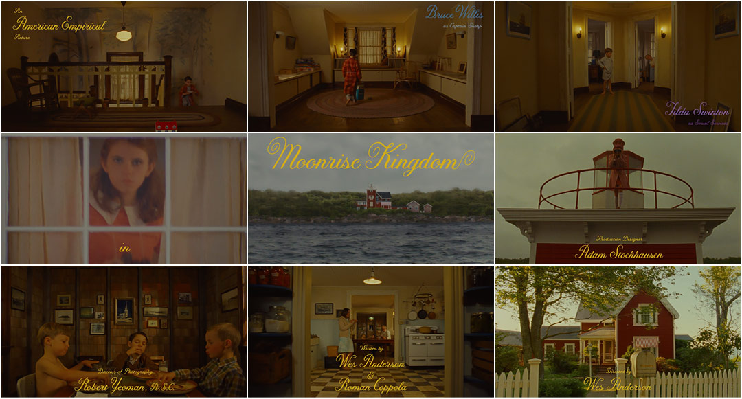
The opening sequence of Moonrise Kingdom is an absolutely brilliant use of cinematic elements that ultimately creates the persona of the film. The use of the pan in the first few shots gives the film a synergy feel as the music and visuals come together to make a playful introduction. A major emphasize I have been focusing on lately is attention to set design, color palates and character appearances, this film does a great job establishing the mood with its opening shots. Additionally throughout the film the focus on screen area, vectors and framing is overwhelmingly apparent. Another interesting aspect of this film is how even the yellow text at the opening was picked due to the location being in New England. The type of font they chose was an older type than the time being portrayed due to the old school vibe of New England which the production team deemed was not as trendy opposed to a populated region of the country, therefore New England due to its slow changing environment it would take longer to adopt even simple trends such as text. As I am working as the art director in my production team for our short student film I have found that finding references such as this opening title sequence is huge to the success of our films look and feel. I learn so much about small details such as the font example, set design and many other insights from these videos. Lastly these are cinematic techniques that can be manipulated and pieced back together to ultimately play a key role in our student film and future films alike.
click on this link to watch the opening title sequence...
Moonrise Kingdom (2012) — Art of the Title
No comments:
Post a Comment