I recently started watching the show Mad Men and was simply floored by the aesthetic and production design. In making a period piece you have to be extremely attentive to even the smallest details. A visual that doesn't match the time could cause a jarring halt to the audience's immersion.
As I was looking up pictures of the set this one really caught my eye. If you are at all familiar with Piet Mondrian's work you can easily spot similarities. In a large selection of his artwork he focuses on using only primary colors and bold simple lines in his compositions. This classic combination of red, blue and yellow is seen everywhere from advertisements to IKEA furniture (and even the set of Mad Men!)
 |
| Composition II in Red, Blue and Yellow, 1930 |
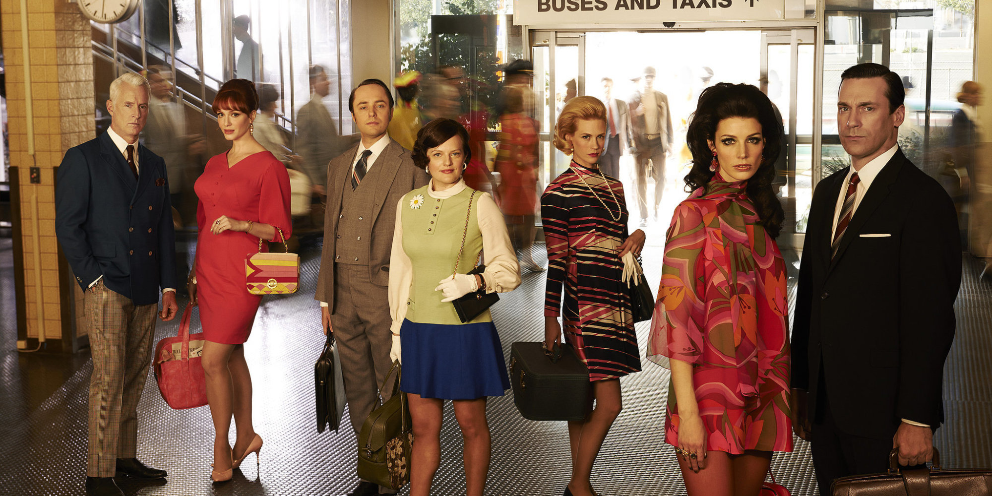
Other than the set following famous artist's concepts, the costume design is extremely on point. It is always matching the year the show is in. My roommate is obsessed with this show and explained to me that you can actually see the fashion evolve as time passes throughout the seasons. When they start in 1960 the 'wet look' is very prominent with all of the men's haircuts slicked back. As it progresses they have softer almost feathered hair. With the woman's clothing you can see how the dresses became shorter and shorter, revealing more skin. Just see how flawless they all look:
It took me awhile to get into the show because, to be honest, it's quite a slow start. But with how many awards Mad Men has won it is now apparent to me why the completely deserve it. If you watch you'll definitely appreciate the painstakingly details put into every aspect of the show's design.

No comments:
Post a Comment